


I booked a trip to Canada – where I am writing from now. Looking for the most reasonable air-fare, the runaway winner was Icelandair, who run seasonal flights ending in October, If theres a transfer in Rejkyavik they offer a free stopover of up to seven nights. I have a good friend who sadly is about to return to Australia – but wanted to see as much of Europe as she could, so – and off I went with companion in tow.

I didn’t really book enough time (2 days) to go and see a lot and we spent a lot of time in Reykjavik before driving out to the area southwest of the country around Hafnarfjordur.

I’m drawn to this kind of place, I enjoy the bleakness, (for proof see my last post on Dungeness), it also has a rich otherworldly or alien quality and feels rich and mysterious.


We were heading towards the famous Blue Lagoon, for a late afternoon dip in the thermal waters and the weather was miserable. I posted on Facebook that it made the west coast of Ireland look like Barbados, I was only half joking. The afternoon before the Blue Lagoon consisted of parking, going for a long walk, getting soaked in seconds, returning to the car and hiding in a cave.

The Blue Lagoon is amazing, I didn’t take a camera or even a phone, I had made that time to hang out and relax, there’s something about taking photos that can get in the way of experince sometimes. Ironically it was the only time the sun came out that day (briefly), when we were in the water and it didn’t matter.

Having said all this, i think i need to be clear, I loved every minute of it. I have eight hours on my way back – If i can wriggle out of the airport I’ll go back and find something else to shoot.


I’m a big fan of Kent, If you know my blog you’ve seen shots from Whitstable already. I also plan to go to Dungeness before Summers out – as it’s a beautiful – if a bit of a ghostly place.
While there are some places I’ll probably never go due to tricky reputations, loads of of it is amazing. It’s hard to put a reason to why I like it. Its partly due to the fact that people are often approachable – and I find people don’t conform in quite the same way that Londoners do. It feels like people are themselves more here, less worried about how they appear. Classes mix better, there’s less snobbery, It feels freer, wilder and older, more traditional without necessarily being fuddy-duddy.

I’ve been to Margate a few times – and there’s even an old post of the seafront with a couple of friends walking by. But that was a rainy winters day. I was really pleased to see the seafront full of sun worshippers as our car turned the corner to face the beach. Theres a swimming pool right on the beach, I guess for younger and the less strong / more anxious swimmers, and I caught them there and on the beach itself (above) as the sun was descending. 

Back at my current favourite railway station. Moving around this city is hard – I have never been anywhere where its as difficult and so busy.


Dynamic light comes with the season. I keep saying it and it keeps being true. Here I am back in my favourite Vancouver Coffee house, the weather keeps saying we’re going to experience apocalyptic rain – well it hasn’t happened yet – which is great.


A few weeks ago, on the way to work, I was admiring the change in seasons in London. Passing over the Thames on my commute I was struck by the mist that covers London on some mornings at this time of year, before the sun rises high enough to burn it away. I spent a few mornings getting up extra early with camera to catch the scene as I suspect it will only be here for a few weeks before the seasons shifts again.

Todays post finds me back in Vancouver – another holiday there, I can’t quite seem to get enough. I took some photos of the state capital of British Columbia, a city called Victoria. Its on Vancouver Island and so like Thames has a relationship with the water, but the hitory is shorter and so the coastline is wilder,. I’m always thinking of the scale of North America about the scale of North America – I wanted to compare it to a photograph I took of the Thames in London.

I’m sorry its been a while – What with work and spending a lot of time refreshing my graphics and photography website, I have to keep on top of my portfolio, even though that often seems to be a job in itself. Anyway, website: I’m pleased to say is now up. I’t only its second draft so I will be polish, polish, polishing it. Have a look:
http://www.kevinricks.com


I got a rhythm up working for a client/friend who needed portraits of nursing students taken for a book. It was the last day of their course and meant to take an hour, but more and more students just kept coming. In my corner of the lecture hall I cracked on and was finally ushered out by the lecturer who was waiting to start his lecture. 86 portraits in an hour, with no time to be creative i set up and decided to get a good rapport with the students. Looking at them now I feel really excited for them, all excited about to finish university and begin new careers.

Tony Ray Jones – American Colour
80 pages
45 colour plates
20 cm x 20 cm
Hardcover with dustjacket
Publication date: September 2013
€25.00 £20.00 $30.00
ISBN 9781907946554
I’ve been out buying books again, Tony Ray Jones is a photography hero of mine, I discovered him while writing an essay about photography and british culture. I was struck that his 1973 book “A Day Off” stood perfectly between the imperial Bill Brandt and the garish work of Martin Parr. I was captivated by the book because Ray-Jones address subjects like tradition, class systems, modern (as it was then) culture and other social themes from a british perspective. The images are always interesting, sometimes cutting and often humourous. Sadly my budget doesn’t stretch to the £800+ out of print copy I saw, well priced too – as I believe Tony Ray Jones to be a pioneer of british social documentary. Do note that although I’m not reviewing this part of his work there’s an excellent retrospective compiled by Martin Parr (and including some of Parrs Early work) at the Science Museum.
Naturally hearing a ‘sketchbook’ of his earlier work, American Colour, had been released by the publishers MACK I was very happy – (I can afford £20). I was very curious about American Colour to see the images from Ray-Jones’ early career.

Although working for CBS in New York as a graphic designer / art director, Ray Jones had a depth of understanding of the medium of photography was hanging around with Joel Meyerowitz and Garry Winogrand in New York taking pictures. It must be remembered in the early 1960’s the creative photography scene was very much on the outside of the “art Establishment” and colour photography was on the outside of the creative photography scene. To illustrate further Martin Parr expressed his belief that the use of colour film was rejected by an ‘old guard’ of photographers in the UK until the 1980’s.
This collection of colour images is very successful in portraying a New York of the time, they often also betray his graphic design background in the way he uses composition and order. But why did Ray Jones work in black and white for England, and colour for this earlier American work? Here’s a quote from him on the subject;
I found America a very colour-conscious country. Colour is very much part of their culture, and they use it in crazy ways. You look down Madison Avenue at lunchtime and the colours just vibrate.
Tony Ray-Jones
 I believe this to be true – having been to the US the two things that strike me are always the country’s colour and scale – both are very different from that here in the UK.
Even though New York photographer Saul Leiter was unknown at the time, so it’s unlikely Ray-Jones would have been aware of his photography work, there are parallels between Leiter‘s and Ray-Jones’ photographic work, For example use of structure, content and technique – such as playing with foreground, middle ground and background, and focusing on small sections of a larger image . However, images in “American Colour’ were also created about the time of Robert Franks’ groundbreaking work “The Americans” – which Ray-Jones would have been aware of, see the images of the biker fro an example.
This book appears to have parallels with the beauty of Leiters work and contains some of the documentary of Robert Frank – although compared to A Day Off. It’s a softer version, considering cultural observations without Franks often cold eye and considering beauty without the extreme abstraction of Leiter – it also definitely borrows from Ray-Jones’ graphic training. Tony Ray Jones has has own observations, where he uses his cultural, professional and photographic references to ask, “How does the New York / American experience reveal itself”.
I think its a beautiful book, in each image outsider Ray-Jones examines ‘american-ness’, curious about a countries aesthetics, perspective and people – and although it doesn’t have the sheer documentary brilliance of “A Day Off” it is an illustration of a great british photographers early development moving from design, commercial art-drectionand into an emerging style which was both surprising and thrilling.


Dad in Shoreditch Sunlight, Tuesday 15th October.
I took some photos of my dad on Tuesday, he’s off to Scotland to be a hermit this winter. As he’s going through some kind of renaissance. He’s going to spend the time meditating, living simply and being close to nature.


Work is always work, but sometimes its fun – which is not to say I don’t take it seriously. Recently an educational client promoting an Arts Award sent me to Leicestershire where students were learning a dance routine, these students were also being filmed by media students. The brief was to capture portraits,dance rehearsal and the filming activity. And it was only on for three hours.
(if you are after technical info on low light go to the bottom of the page)
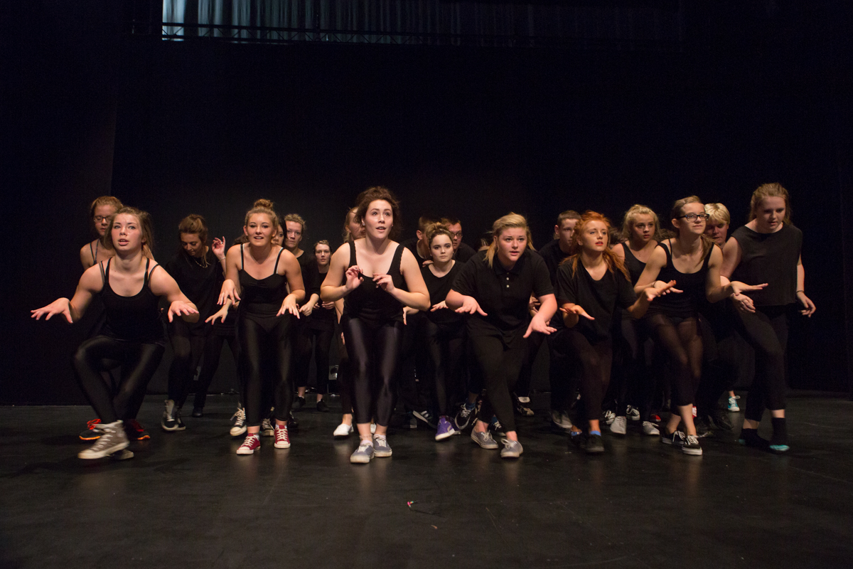
I was thrilled to find them friendly and motivated, wait – excited, about the day ahead of them and full of energy. I was also happy to find out they were rehearsing the dance from Rocky Horror’s “Timewarp” – and to finish with a performance in full costume, which the media students would film.

Remembering what it was like to be a student, I realised I would have to catch them in this window for sure. They drift off outside of prescribed hours so quickly it can make your head spin. So it was a tough brief, but I like the challenge. The challenge was also the lighting – I have done a few shoots in these type of environments and I’m often working out on the fly how to balance the three desirables of low light shooting: Freezing action, low noise (grain) and using the correct aperture to get what you need sharp.

I know I don’t really ever talk technical on my blog, but the toughest part is working out which way you’re going to shoot in low-light, especially during a fast moving dance or sport performance. The three main ways are:
1) to drag the shutter and use a second curtain flash to freeze the action – you will get some blur but it can be very effective* if done well.
2) to use a high ISO and get loads of grain (noisy photo),
3) to try and balance ISO, shutter speed and use a little fill flash – which is tricky when the stage lights are so much warmer (orange) than the flash (blue), it can make the results unpredictable.
This third option was my main approach for stage shots. You can see a slight difference in the header image where the centre dancer – the blonde woman, has a good colour temperature, but behind the others are a shade more orange, but the level is acceptable to me.
(*Thanks to http://exposureleeds.org/ for the link).


After some time doing product work I got to do some work with Sous Chef, an online company who cater for individuals, restaurants and reviewers. The supply hard to find ingredients and specialist cookware. The heart of the operation is a charming couple from London who are dedicated to this growing new business. And boy can they cook! I enjoyed the Tamales they served me during the day. I will refer to them as HOT TAMALES after a favourite track of mine
Here are some shots from the day:


