I helped a friend out shooting her artwork for her catalogue. I have worked with her and watched her grow from a personal trainer to an artist over the last three years. This time she told me she has just had an offer for representation by a dealer, which is great! The painting shots get easier. They always need a tiny bit of post production because the lenses bow an image slightly. But it’s easy enough now I have had 40 odd painting to shoot.
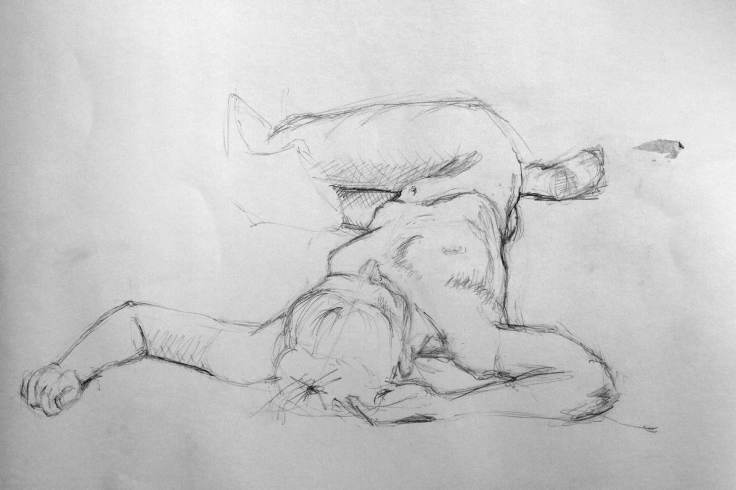
So 45 min into a two hour studio booking and it was done, she and her friends left to deliver the artwork. And i had all this studio time left over, so I wanted to work on my three point lighting . This link I’ve added doesn’t show the back lighting enough in my opinion, but there are plenty of video tutorials online – they’re better than diagrams because they show how high the lights are for your desired effect.
Using myself as a model (which is hard – because you cant be on both sides of the camera at the same time. I did this for a while and ended up dropping one of the lights (the fill) right back. Here’s the result, after a little post production (literally a tiny bit of extra contrast and desaturation. So now I just want to try it out on someone else. Any takers?
80 pages 45 colour plates 20 cm x 20 cm Hardcover with dustjacket Publication date: September 2013 €25.00 £20.00 $30.00 ISBN 9781907946554
I’ve been out buying books again, Tony Ray Jones is a photography hero of mine, I discovered him while writing an essay about photography and british culture. I was struck that his 1973 book “A Day Off” stood perfectly between the imperial Bill Brandt and the garish work of Martin Parr. I was captivated by the book because Ray-Jones address subjects like tradition, class systems, modern (as it was then) culture and other social themes from a british perspective. The images are always interesting, sometimes cutting and often humourous. Sadly my budget doesn’t stretch to the £800+ out of print copy I saw, well priced too – as I believe Tony Ray Jones to be a pioneer of british social documentary. Do note that although I’m not reviewing this part of his work there’s an excellent retrospective compiled by Martin Parr (and including some of Parrs Early work) at the Science Museum.
Naturally hearing a ‘sketchbook’ of his earlier work, American Colour, had been released by the publishers MACK I was very happy – (I can afford £20). I was very curious about American Colour to see the images from Ray-Jones’ early career.
Tony Ray Jones – American Colour
Although working for CBS in New York as a graphic designer / art director, Ray Jones had a depth of understanding of the medium of photography was hanging around with Joel Meyerowitzand Garry Winograndin New Yorktaking pictures. It must be remembered in the early 1960’s the creative photography scene was very much on the outside of the “art Establishment” and colour photography was on the outside of the creative photography scene. To illustrate further Martin Parr expressed his belief that the use of colour film was rejected by an ‘old guard’ of photographers in the UK until the 1980’s.
This collection of colour images is very successful in portraying a New York of the time, they often also betray his graphic design background in the way he uses composition and order. But why did Ray Jones work in black and white for England, and colour for this earlier American work? Here’s a quote from him on the subject;
I found America a very colour-conscious country. Colour is very much part of their culture, and they use it in crazy ways. You look down Madison Avenue at lunchtime and the colours just vibrate.
Tony Ray-Jones
I believe this to be true – having been to the US the two things that strike me are always the country’s colour and scale – both are very different from that here in the UK.
Even though New York photographer Saul Leiter was unknown at the time, so it’s unlikely Ray-Jones would have been aware of his photography work, there are parallels between Leiter‘s and Ray-Jones’ photographic work, For example use of structure, content and technique – such as playing with foreground, middle ground and background, and focusing on small sections of a larger image . However, images in “American Colour’ were also created about the time of Robert Franks’ groundbreaking work “The Americans” – which Ray-Jones would have been aware of, see the images of the biker fro an example.
This book appears to have parallels with the beauty of Leiters work and contains some of the documentary of Robert Frank – although compared to A Day Off. It’s a softer version, considering cultural observations without Franks often cold eye and considering beauty without the extreme abstraction of Leiter – it also definitely borrows from Ray-Jones’ graphic training. Tony Ray Jones has has own observations, where he uses his cultural, professional and photographic references to ask, “How does the New York / American experience reveal itself”.
I think its a beautiful book, in each image outsider Ray-Jones examines ‘american-ness’, curious about a countries aesthetics, perspective and people – and although it doesn’t have the sheer documentary brilliance of “A Day Off” it is an illustration of a great british photographers early development moving from design, commercial art-drectionand into an emerging style which was both surprising and thrilling.
Saul LieterRobert Frank (From the Americans)Tony Ray Jones – American Colour
I took this in a place called Kilrush in Ireland a couple of years ago when I was visiting my grandmother, who wasn’t very well.
It was either December or January and the sea mist had crawled inland each morning, the cold weather had also brought a snap of frost so the mornings looked like this. I remember thinking that this is what Winter meant, that the world had been suspended and time had stopped.
The morning we left we awoke to snow, a different landscape, time had resumed its normal pace and the spell of the frost and mist was broken.
The Brick Box Ladies are at it again. Friends, clients, and generally shiny people, these ladies change the perception of public space to show people how it can be used effectively.
I’ve designed some posters for their latest event, see the website. I wonder which one they’ll choose?
The fonts have already been determined by the website. NASA stock image.
At their last event, over the summer on Friday nights they held shows, and audience participation events under the A13 flyover (road if you’re from outside the UK). These included and elvis act, rock and roll DJ’s, hula hoop lessons, dancers, performers and allsorts, completely for free and designed for all ages.
I took the background picture outside Victoria Station on Tuesday night. Manually focused my lens to 45cm, opened it right up (f.1.4) and adjusted the exposure to 2/3 under. Then I found some buses and city lights to capture.
Anyway – Now they’re doing Londons first Light Night, at the same venue – the Light Night websitedescribes it thus:
This is a festival of light, community and energy – it’s completely free and open to all. The programme has been designed to entertain and illuminate, inspire and celebrate. New York lighting artist, Leni Schwendinger, will be leading a NightSeeing Programme, encouraging us to explore and discover the nocturnal city. Artists from Speirs & Major, and Output Arts will fill the darkest reaches of the A13 underpass with light, energy and magic. At Bow Creek Ecology Park, visitors can enjoy Milk Pixel: an interactive low & high tech hybrid of light and junk. Plus there’s the Neon Workshop switch on at the A13. There’ll also be music, food, dancing, games, workshops and more to be announced soon.
NASA stock image 2, the surface of the moon half in shadow, I love their database.
I really enjoy Neil Gaiman’s work, from “Sandman” (I only ever had one copy, but thats all I needed as a friend who was happy to loan me their copies had all the others), I’ve also read a few of his books (American Gods is great), and seen some of his work adapted for film and TV. Well, don’t I sound like the fanboy. What I like about him is he’s really clever but keeps it accessible and in his books anything is possible.
Anything is possible, hmm, well In this address to the University of Arts this is exactly what he tells the graduates. Weaving a picture of the world of the freelance creative he speaks of the terror and thrills of having your own vision and pursuing it. I find it inspiring. Especially as I have no idea what is going to happen next….