Search

Road to wherever

Tag

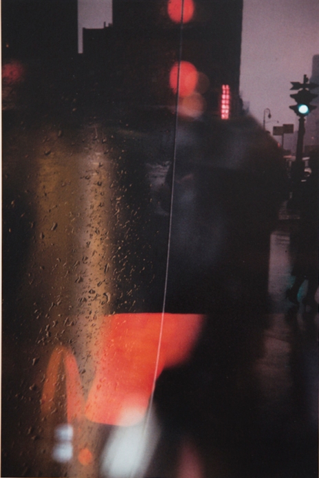
Saul Leiter

Tony Ray Jones – American Colour

(MACK)

80 pagesBR
45 colour plates
20 cm x 20 cm
Hardcover with dustjacket
Publication date: September 2013
€25.00 £20.00 $30.00
ISBN 9781907946554

I’ve been out buying books again, Tony Ray Jones is a photography hero of mine, I discovered him while writing an essay about photography and british culture. I was struck that his 1973 book “A Day Off” stood perfectly between the imperial Bill Brandt and the garish work of Martin Parr. I was captivated by the book because Ray-Jones address subjects like tradition, class systems, modern (as it was then) culture and other social themes from a british perspective. The images are always interesting, sometimes cutting and often humourous. Sadly my budget doesn’t stretch to the £800+ out of print copy I saw, well priced too – as I believe Tony Ray Jones to be a pioneer of british social documentary. Do note that although I’m not reviewing this part of his work there’s an excellent retrospective compiled by Martin Parr (and including some of Parrs Early work) at the Science Museum.

Naturally hearing a ‘sketchbook’ of his earlier work, American Colour, had been released by the publishers MACK I was very happy – (I can afford £20).  I was very curious about American Colour to see the images from Ray-Jones’ early career.

1993-5016_1048
Tony Ray Jones – American Colour

Although working for CBS in New York as a graphic designer / art director, Ray Jones had a depth of understanding of the medium of photography was hanging around with Joel Meyerowitz and Garry Winogrand in New York taking pictures. It must be remembered in the early 1960’s the creative photography scene was very much on the outside of the “art Establishment” and colour photography was on the outside of the creative photography scene. To illustrate further Martin Parr expressed his belief that the use of colour film was rejected by an ‘old guard’ of photographers in the UK until the 1980’s.

This collection of colour images is very successful in portraying a New York of the time, they often also betray his graphic design background in the way he uses composition and order. But why did Ray Jones work in black and white for England, and colour for this earlier American work? Here’s a quote from him on the subject;

I found America a very colour-conscious country. Colour is very much part of their culture, and they use it in crazy ways. You look down Madison Avenue at lunchtime and the colours just vibrate.
Tony Ray-Jones

1851bdff74c5a4162bb6c771490777dcI believe this to be true – having been to the US the two things that strike me are always the country’s colour and scale – both are very different from that here in the UK.

Even though New York photographer Saul Leiter was unknown at the time, so it’s unlikely Ray-Jones would have been aware of his photography work, there are parallels between Leiter‘s and Ray-Jones’ photographic work, For example use of structure, content and technique – such as playing with foreground, middle ground and background, and focusing on small sections of a larger image . However, images in “American Colour’ were also created about the time of Robert Franks’ groundbreaking work “The Americans” – which Ray-Jones would have been aware of, see the images of the biker fro an example.

This book appears to have parallels with the beauty of Leiters work and contains some of the documentary of Robert Frank – although compared to A Day Off. It’s a softer version, considering cultural observations without Franks often cold eye and considering beauty without the extreme abstraction of Leiter – it also definitely borrows from Ray-Jones’ graphic training. Tony Ray Jones has has own observations, where he uses his cultural, professional and photographic references to ask, “How does the New York / American experience reveal itself”.

I think its a beautiful book, in each image outsider Ray-Jones examines ‘american-ness’, curious about a countries aesthetics, perspective and people – and although it doesn’t have the sheer documentary brilliance of “A Day Off” it is an illustration of a great british photographers early development moving from design, commercial art-drectionand into an emerging style which was both surprising and thrilling.

saul-leiter-creative-shoot-inspiration-engagement-10-e1331659967973
Saul Lieter
robert-frank-the-americans-motorcyle-bike-riders-rebel
Robert Frank (From the Americans)
trj6.480x480-75
Tony Ray Jones – American Colour

“A question of Colour”

ReviewI saw this exhibition at Somerset House London last Thursday, It was pointed out to me by another blogger, who had nothing but high praise for it. The title; “Henri Cartier Bresson – a Question of Colour” holds that name that carries a certain type of weight which may or may not be problematic. I should point out while I respect Henri Cartier Bressons position in the history of photography, I have yet to be totally thrilled by his work. (Is this photography heresy?)

This show plays with the fact Cartier Bresson was unimpressed by colour (yes, I know he did use it on occaision) as a medium for photography. Personally I am passionate about colour photography, perhaps this is one of the reasons I haven’t given him much time.

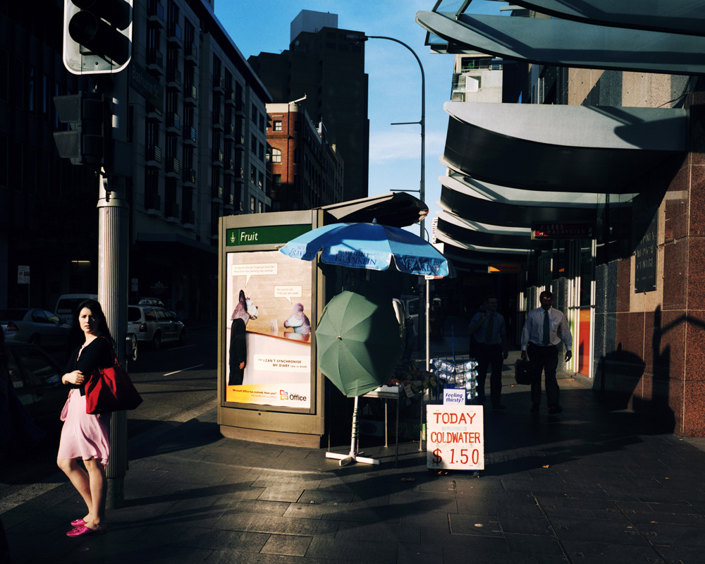
Trent Parke “Today Cold Water”

However “A Question of Colour” is deftly curated to challenge Cartier-Bressons perception of colour, the show presents Cartier Bresson black and white prints (previously unseen in the UK) that display his command of illustrating form, then show those who have been influenced by his work using colour in creative, sorry, exceptionally creative ways. Interestingly this has been put together as a positive. Reinforcing Cartier Bressons influence, and the practice of using colour. Nice.

This is an amazing collection for me in many ways. I am familiar with Saul Leiter, Fred Herzog, Trente Parke (above), Joel Meyerowitz – but it has altered the context of other photographers I know Carolyn Drake, Helen Levitt, and introduced me to some who I can see myself admiring for some time to come, particularly Boris Savelev and Harry Gruyaert. These are truly sophisticated images, rich and descriptive in their use of colour and tone.

My wallet, usually full of dust and cobwebs, was gleefully prized opened to buy a copy of the book that came with this show. The shop assistant told me  it had sold out over a week before. SO thats over two weeks before the end of the show? Testimony to how people have enjoyed it, and enough to warrant a reprint… please?

Boris Savelev

When I saw this show I became really excited, its obvious this is similar to something I am reaching for with my shots, well those that are like this. Which is why, for me, this is the most successful exhibition of the last twelve months. So I emailed the curator, William E. Ewing, to tell him how impressed I was- he mailed back to say hello. Charming fellow.

The show closes this Sunday! But it is free…

If your image is hotlinked above and you’re not happy about it let me know…

London

Tests from my ongoing project

I have been looking at how to make a project about London. It’s a work in progress about both my relationship with it and how its like a machine that almost swallows us up. London has a network of surfaces, built environments and underground states, a human Habitrail.  The idea is muddled at the moment, with occasional flashes of what I want (see my pictures above) – this is how projects usually are at their inception. Is it architectural? Is it street photography? Its it something else? What about the references to the photography of the 1920’s / 1930’s and 1940’s. Such as Margaret Bourke White pieces and how these work. I want this to come to fruit, but I’ll have to be very careful on how to proceed…

There are many other references to this that have been on my mind. Paul Graham / the Present, take on the street and the way our attention moves from moment to moment, it also often suggests our introversion while being in a city. (the printing and depth of colour in this book is stunning).

I also bought Adam Hinton / Shibuya – where he seems to talk about our personal relationships with city in terms of work, commuting and smoking. You’ll notice these two works have a very differing approach to the scale they operate on.

And then there’s the question of beauty, London can be beautiful, sometimes in a way that is terrible. But some opinions leave me feeling an image that shows beauty is often unjustly treated as a meaningless. This is a popular theory and something I disagree with, I dont really care if that’s unfashionable. To go back to Saul Leiters statement on the subject:

“I must admit that I am not a member of the ugly school. I have a great regard for certain notions of beauty even though to some it is an old fashioned idea. Some photographers think that by taking pictures of human misery, they are addressing a serious problem. I do not think that misery is more profound than happiness.” – Saul Leiter

Saul Leiter – Early Color

Photobook Review | 05 April 2012

A question of boundaries

Leiter, Saul. (2006), Early Color, Third edition 2011, Steidl, Germany – See Images from the book below:

http://www.steidlville.com/books/145-Early-Color-Second-Edition.html

Looking at Early Color I was instantly drawn to one image, early in the book, ‘Dog in doorway, Paterson, 1952’. Its construction was so simple, but rather than being a chance shot it’s very carefully considered. Taken through a rear car window, seen as a hook of black framing the picture, it contains a shop front that looks like its been converted into a residence. The whiteness of the title dog pops out from a palette of muted greens, cast in the same flat American light used by the painter Edward Hopper.

Image

Dog in doorway

At it’s best street photography has the ability to show daily life, provoking a range of responses from the viewer, among them an appreciation of humour, honesty, beauty, or perhaps inspiring a sense of awe or even clarity. The photographs in Saul Leiters book are street photography, at least in the literal sense. As slices of time captured on of the streets of New York these pictures search for a semi-representational beauty in the everyday. There’s no doubt Leiter’s motivations are to create beauty and joyful images. He even stated this as his intent in 1959:

“I must admit that I am not a member of the ugly school. I have a great regard for certain notions of beauty even though to some it is an old fashioned idea. Some photographers think that by taking pictures of human misery, they are addressing a serious problem. I do not think that misery is more profound than happiness.”

Early Color gives the subject away through its title. It would a shame to pass by this innovative and surprisingly early collection of colour work, especially as it’s been rediscovered recently. (Leiter having been exhibited sporadically in the US until 2006, after which his photography began to be shown on an International level to much acclaim).

Personally I find two things particularly interesting about Leiter. Firstly, although having influential friends and contemporaries, he’s had a distinctive approach that clearly draws from his two reference points, painting and photography. This seems to be achieved without conflict. Secondly, as he embraced colour photography in its infancy, he was open to its anomalies and developed his own techniques.

Leiter’s work is very different to other American colour photographers, such as Stephen Shore, Joel Meyerowitz or William Eggelston, in its delivery. A pioneer of colour work his photography work was produced much earlier, between 1948 and 1960, so his links to photography are older. Leiter states Henri-Cartier Bresson as an influence and was also personally acquainted with Walker Evans, Robert Frank and Diane Arbus – who lived opposite him. As well as using black and white these photographers had a completely different approach to Leiter, their work being more literal, various kinds of documentary photography.

So where are Leiters roots? At the time of the first images in this book Leiter also exhibited abstract expressionist paintings alongside Willem De Kooning and Philip Guston. For someone who is now receiving so much acclaim for his photography it’s curious that Lieter still believes himself to be more of a painter than a photographer. Leiter also says he never felt a part of any school or movement. There is an argument for looking further into the relationship the photographs in Early Color have with painting. For example, while painters and photographers may take inspiration from an artist like Edward Hopper, look at ‘Dog in Doorway’ again and it seems very likely Leiter is one of them. There’s also a direct reference to Piet Mondrian in ‘Mondrian Worker, 1954’. An image which humorously draws a comparison between a Mondrian De Stijl painting and a workman hanging rectangular boards of different shades, as if the worker’s assembling one of these artworks. But the most striking parallel is the cover image to Early Color, ‘Through Boards, 1957’. This photograph has richness in construction and colour highly reminiscent of Mark Rothko’s late period which began ten years before. As a practicing painter working with abstract expressionists, Leiter would have been aware of all these artists and their work. Though the book seeks and explores subjects rich in colour, these could be represented on a sliding scale, at one end realism (Postmen, 1952), and at the other abstraction (Walk with Soames, 1958). His work deftly negotiates both, never fully committing to either.

Image

Walk with Soames

The images in Early Color also have many signatures that create ambiguity. For example exteriors shot through glass misted with condensation, street scenes taken through gaps in boards or under awnings and fragments of type from shop fronts or advertising. Even Leiter’s figures are often obscured by shadows or reflection, out of focus or shot from angles that force people into a generic form. This refuses any direct empathy between the viewer and the subject as an individual. The character of his images is instead created by colour, evocative and rich, even when the palette is minimal. Leiter also uses techniques that apply further degrees of ambiguity, resulting in something greater than the sum of its parts. Again and again he also layers the abstracted colours and shapes he creates to pull a new order and unity in these photographs, for example on the lead image ‘Phone Call, 1957’. Leiter has a command of colour, using it in various ways; muted, complimentary, bright or contrasting with rich and varied results. It’s interesting that in considering himself as a painter he was able to embrace chance and avoid the constraints of conventional practice. He uses emerging colour technology without fear of losing control of the outcome, as in its early years colour-processing results were unpredictable. Leiter also encouraged mutation by seeking out expired film stock to use for shooting.

There’s no doubt to define the boundaries of a good ‘street photograph’ is problematic. An approach that succeeds capturing one type of image is often not going to work on another. This is something that Leiter’s work illustrates. If a photographer or artist defines themselves in those terms only, surely this must constrain some of their creativity? ‘If I am a photographer, must all my influences be photographic?’

Robert Adams claims in his book Beauty in Photography, “For a picture to be beautiful it does not have to be shocking, but it must in some significant respect be unlike what has preceded it, (this is why an artist cannot afford to be ignorant of the tradition within his medium)”. Looking at Leiter’s pictures, I don’t know of anything similar that preceded them. As his work has only recently reached acclaim I don’t yet know anything that bears their influence, though I’m sure this will happen. Regarding ‘tradition within his medium’, this is only part of the argument, as Leiter’s work illustrates. There’s no doubt that Leiter has knowledge of photographic arts, at the very least through his photographic peers. He is also a photographer, as he takes pictures. Yet he also draws frequently on visual influence outside his chosen medium, looking to his roots in fine art. This may well be what makes this book so compelling. His work comfortably straddles between painting and photography, through it Leiter has caught the daily beauty of a city.

Bibiography:

Leiter, Saul. (2006), Early Color, Third edition 2011, Steidl, Germany

Adams, Robert. (1996) Beauty In Photography, Aperture Foundation, New York.

Adams, Robert. (1994) Why People Photograph, Aperture Foundation, New York.

Howarth, Sophie & McLaren, Stephen, (2010). Street Photography Now, Thames and Hudson, London.

Postmen, 1952

Walk with Soames, 1958

Create a free website or blog at WordPress.com.

Up ↑

Lucas Dewaele, dagboek

Over fotografie en leven.

Darrell Steele Photography

A good picture is equivalent to a good deed - Vincent van Gogh

Jnana's Red Barn

From Sunrise County in the Universe

Photographs by Timothy S. Allen

Exploring the World with a Camera

5 things to do today

Things to do in London, Surrey and beyond. What will you do today?

Street Photography

Straßenfotografie • Beobachtungen am Wegesrand

Geschäfte mit Geschichte - Waren aller Art in Wien

Fotografien alter Geschäftsportale und Geschäfte in Wien

2me4art

Life as i stumble through it

Matthew Fray

Author and Relationship Coach

Totally Iain Duncan Smith

The Totally Official Blog Of The Secretary Of State For Work, Pensions And Kicking Ass

COOKING ON A BOOTSTRAP

by Jack Monroe, bestselling author of 'A Girl Called Jack'

PHIL KNEEN

Photojournalist & Documentary Photographer

Silicon Valley Types

portraits & figures by an older woman artist, with blue collar roots